Thursday December 15 1947 "It was the best of times it was the worst of times..." [Tale of Two Cities, by Charles Dickens, referring to the time of the French Revolution and during the midst of Dr. Neuage's Excel class]

http://www.wmburgweb.com/Resources/Lesson/charts.htm
Add an angled border to an empty cell
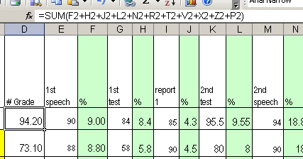
Today we will begin adding figures from different columns to our equations. For example, I do this for a class I teach at University at Albany - notice it all begins with +SUM(:
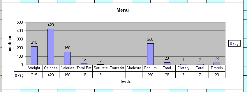
| DISCLAIMER: I have not eaten at any fast food place such as McDonalds, Wendy's, Burger King and etc for more than twenty years so items that I have chosen are only for this exercise. I have not eaten meat for more than forty-years or foods cooked in animal fat so my choosing french-fries is only for this exercise as I do not eat french-fries from fast-food places due to their being fried in animal-oil. |
I have copied the headlines for you if you did not get it done during the last class. See here mate! If you have already filled in your spreadsheet with the data then you just need to do the angled text thing. If you have not come back to this and put in the data for example the foods you ate. We followed these steps:
Choose our menu

Pick your items
Click the term 'Nutritional Information'
![]()
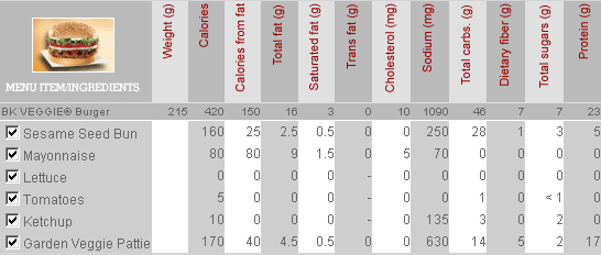
put you data into your spreadsheet PICK AT LEAST FIVE ITEMS (below is one item)
As you should well know (because I have said/demonstrated/thought-to-say, at least a million and fifty times), many times the label at the top of a column is much wider than the data stored in it. For example, the names of your pets have more than 70 letters for each terrifying pet and it looks really budget shrinking and wrapping the name in your Excel spreadsheet though of course it would be even more budget to shrink-wrap your pet. You can use the Wrap text option (Format menu > Cells command > Alignment tab) to make a multiple-word label narrower, but sometimes that is just not good enough. Vertical text is an option, but it can be difficult to read and takes a lot of vertical space. Therefore we will use rotated text and cell borders instead, as shown in the following picture.
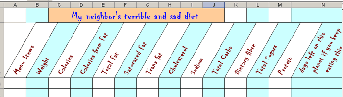
You may also want to use that budget cell that generally remains empty in the upper left corner of a table. You can use an angled border to create dual-label corner cells like the one shown in the following picture.
How to apply angled text and borders to impress and amaze your neighbors (be the first on your block to know this little known trick)
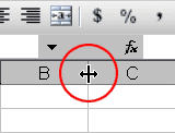
1. Select the cells you want to format.
2. On the Format menu, click Cells.
3. On the Border tab, apply vertical borders to the left, right, and middle of the range.
4. On the Alignment tab, in the Orientation box, click a degree point, or drag the indicator to the angle you want.
Select a positive angle between 30 and 60 degrees.
5. Under Text alignment, in the Horizontal list box, click Center, and then click OK.
Excel rotates the left and right borders along with the text.
6. To shrink all the columns to their smallest possible width, select them, point to Column On the Format menu, and then click AutoFit Selection.
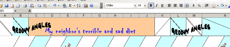
You may also want to use that budget cell that generally remains empty in the upper left corner of a table. You can use an angled border to create dual-label corner cells like the one shown in the following picture by following the simple instructions listed below the image of ‘my groovy angles’.
1. Select the cell you want to format, and then type 10 space characters.
2. Type the first label, which corresponds to the column labels across the top of the table.
3. To create two line breaks in the cell, hold down ALT, and then press ENTER twice.
4. Type the second label, which corresponds to the row labels down the left side of the table, and then press ENTER.
5. With the cell selected, click Cells on the Format menu.
6. On the Border tab, in the Line box under Style, select the line style you want.
7. Under Border, click the upper left to lower right angled border button.
8. On the Alignment tab, under Text control, select the Wrap Text check box, and then click OK.
Or to cut to the chase put your cursor in the cell you wish to angle > go to > Format > Cells > Border and click on the angle symbol and in the Line > Style box – pick the line that floats-your-boat and the colour that you harmonize with then go to > Alignment > and the rest is history.
Before doing the actual exercise we will get our data looking all kool and groovy. Do the following things to your spreadsheet.
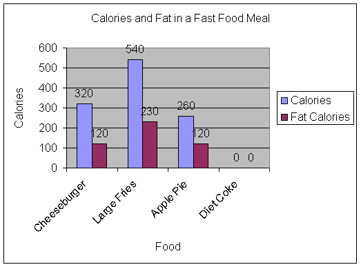
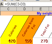
With your spreadsheet opened, you will enter the calories in column C and fat calories in column D.
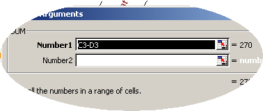
To figure out non-fat calories, write a formula to subtract the fat calories from the total calories. (HINT: =C3-D3) remember all formulas must begin with =SUM(
then using Insert > Function add it all together
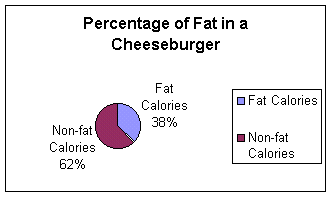
Exercise three B.What is the percentage of calories from fat of your five selected items?
To figure out the percentage of calories from fat, divide fat calories by calories. Format the cells in column E for percentage. (HINT: =D2/C2)
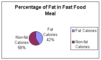
Exercise three C. What is the total calories, total fat calories, and total non-fat calories of your five selected items?
To figure out total calories, total fat calories, and total non-fat calories, you can use the AutoSum button or write a formula. To figure out the total percentage of fat, divide total calories by total fat calories.
You may use AutoSum 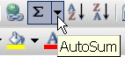 – check that
it is on
http://www.baycongroup.com/excel_2003/excel_02.htm
– check that
it is on
http://www.baycongroup.com/excel_2003/excel_02.htm
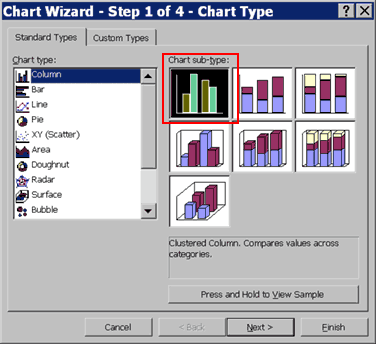
At the end of this you will have a pie-chart and a column chart of your menu choices.
You'll be making three charts to go along with your spreadsheet. Save them as part of your spreadsheet. When you finish the spreadsheet and chart, answer the questions on the handout. Spreadsheets and Charts
After you have created the spreadsheet regarding your meal, you are ready to create your chart.
Changing the Size and Position of a Chart
When you select a chart, handles appear on the right and left sides, the top and bottom, and the corners of the chart. You can drag the handles on the top and bottom of the chart to increase or decrease the height of the chart. You can drag the handles on the left and right sides of the chart to increase or decrease the width of the chart. You can drag the handles on the corners of the chart to increase or decrease the size of the chart proportionally.
You can change the position of a chart by clicking on the chart and dragging
Modify Your Chart
You can modify your chart by using the Chart toolbar. If the Chart toolbar is not already available, choose View > Toolbars > Chart from the menu.
![]()
Chart Toolbar
To change the data area font size:
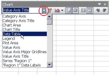
To change the angle of the data labels:
Click the down arrow on the Chart toolbar. A drop-down menu opens.
Choose "Region 1" Data Labels from the drop-down menu.
Click the Angle Counter Clockwise
icon ![]() . The Region 1
Data Labels are angled counter-clockwise.
. The Region 1
Data Labels are angled counter-clockwise.
Repeat this process for Regions 2 and 3.
To change the font size of the Region data labels:
You can also make changes by double-clicking on the item you want to change.
To change the chart scale:
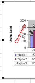
Sample Charts
|